


For several years, neutral palettes have defined high-end residential design.
Soft whites, gentle greys and warm beiges have delivered calm, longevity and broad appeal - forming refined backdrops that sit quietly within a space.
As 2026 unfolds, that approach is beginning to evolve.
In our latest blog, we explore how homeowners are showing greater confidence with colour, favouring richer, more considered tones that introduce depth, warmth and individuality without relying on bold statements or expressive trends.
A Grounded, Considered Palette
The palette emerging across high-end homes in 2026 is warm, grounded and nuanced.
Deep greens, earthy terracottas, soft clay tones, muted blues and warm ochres are replacing cooler greys and stark whites.
These colours draw heavily from the natural world, referencing landscape, raw materials and seasonal variation.
Rather than relying on contrast, the focus is on balance - creating interiors that feel layered, composed and quietly confident.
Using Colour with Intent
In high-end residential projects, colour is most successful when it is applied with restraint and purpose.
The question is not simply which colours are used, but how they support the architecture of the home.
Deeper tones are often most effective when anchored within joinery, feature walls, ceilings or secondary spaces, rather than applied uniformly throughout.
Used selectively, colour enhances spatial hierarchy and reinforces the intended atmosphere of each room.
.jpg)
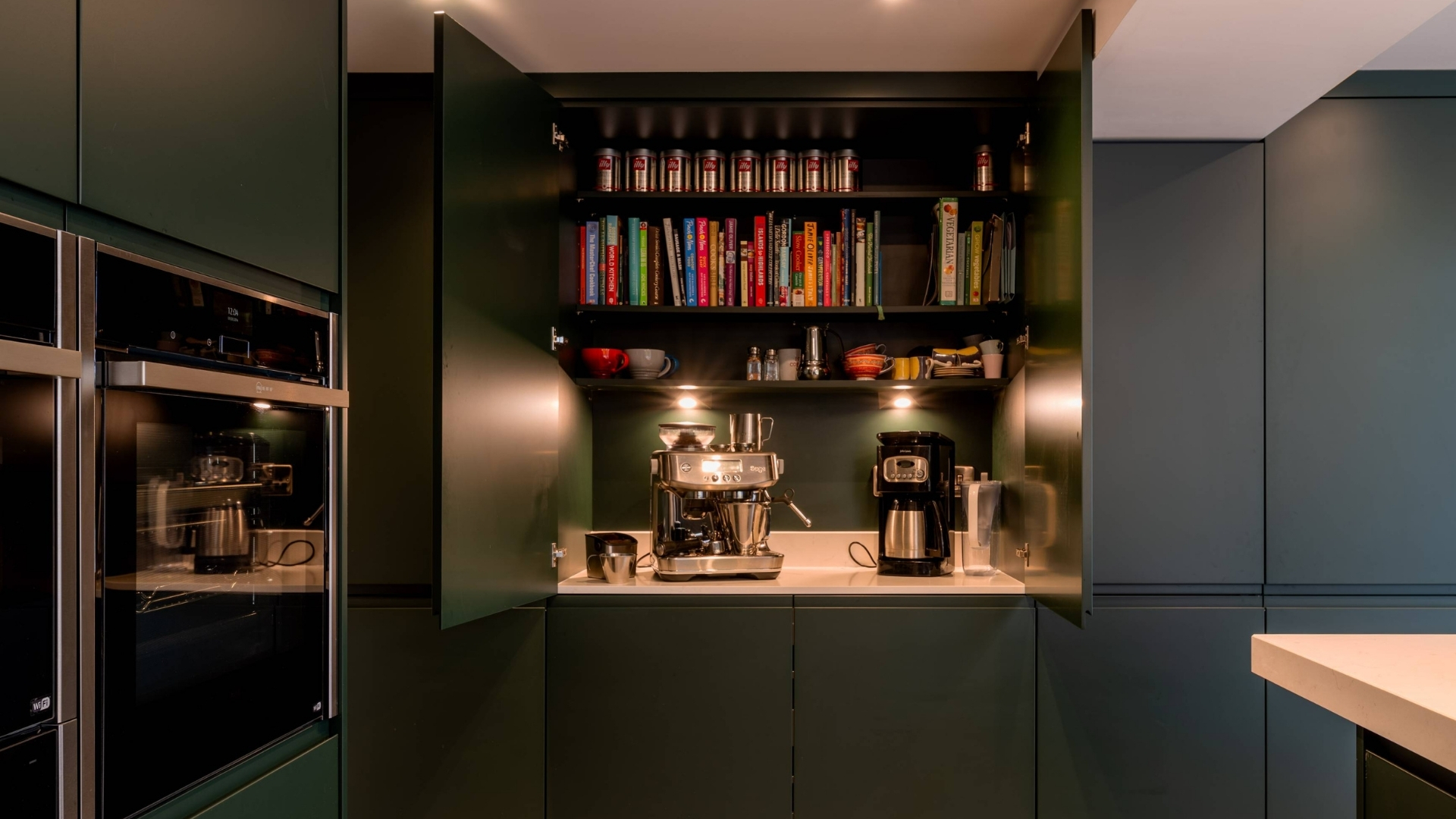
Colour as Part of the Architecture
At Kimble Roden, we believe colour should be considered as an integral part of the architectural composition.
Its relationship with light, volume and proportion is carefully explored at every stage of the design process.
A rich green within a snug or library can heighten a sense of intimacy and enclosure, while warmer tones in circulation spaces help soften transitions between rooms.
The result is a home where colour brings cohesion, rather than distraction.
.jpg)
Pairing Colours with Materials
This confidence in colour sits naturally alongside tactile, honest materials.
Stone, timber, lime plaster and refined metal finishes help ground deeper hues, ensuring they feel timeless rather than trend-led.
Texture plays a vital role.
Subtle variations in surface and finish introduce depth and interest, allowing colour to be experienced quietly, without visual noise.
.jpg)
Closing Thoughts
For clients planning residential projects in 2026, colour offers an opportunity to personalise a home while maintaining longevity.
When informed by architectural intent, natural light and materiality, colour can elevate a space - adding warmth, character and a sense of quiet assurance.
Approached thoughtfully, colour becomes not a statement, but a lasting layer in the life of the home.
If you would like to discuss your project with us, please call 01625 402442 or email us for a free initial consultation.


.jpg)


